[ Content | Sidebar ]

Archives for March, 2010

Perfect Circle: James Nares’ video work, Paul Kasmin, Armory 2010

by Amanda Schmitt on March 16th, 2010

I wouldn’t say I was a fan of James Nares’ paintings — something about the fact that I can never tell if I’m looking at a painting or a silkscreen print really bothers/annoys me. It could also be the fact that his gallery, Paul Kasmin, in their press releases, tries to describe him as an ‘outsider’ artist, making work unlike any of his contemporaries (although, perhaps this is an annoyance felts towards the gallery and not towards the artist). And perhaps it’s the fact that I feel as though Nares is betraying Roy Lichtenstein through his sloshy, macro-brushstroke paintings; it’s almost as though Lichtenstein should have been ‘referencing’ (as contemporary artists so often do) Nares’ paintings in his benday-dot, “Brushstroke,” from 1965. It seems almost in reverse — as though Nares got to the idea first, and Lichtenstein only had to build upon the idea. Or, maybe Nares is ‘referencing’ “Brushstroke” in reverse. Maybe I feel jealous, or protective. I mean, Lichtenstein has a legacy, but Nares gets the 21st century fame! Either way, I’ll quit my gripin’, because this isn’t about Nares’ paintings, but rather his video works, which absolutely delighted me!

What initially drew me in was the noise of PVC pipes gloriously falling, or being thrown — in spastic rhythm — against a wall in an empty concrete room. First of all, I love the sound of PVC pipes: they are like construction’s conga drums and my haphazard percussion instrument of choice. They produce a pleasing range of high and low notes, and could easily be used as a sort of woodwind instrument if somebody put in the effort. So, what drew me into the viewing room was the pipes, aptly titled “Pipes”; what made me stay was the promise of another amusing, titillating video, “Giotto’s Circle” (1976).

“Giotto’s Circe,” follows a trend of single male artists documenting their silly — yet somehow deeply poignant– studio activities on video. What was different about Nares in this video (as compared to William Wegman’s video from the 70s) is the assistant, or friend, who is holding the camera, rather than a fixed tripod (Nares is not flying solo here).

A shirtless young man walks up to a wall in what appears to be a dilapidated warehouse, but is probably the artist’s dingy, yet fabulous, studio in Manhattan. His back is tanned, his shoulder-length hair is wispy and sun kissed, and his pants are pulled high in disco style (all in all, a fine looking man!). He is holding a long, thin piece of metal horizontally, probably 7-9 feet in length. With his back turned to the camera, he begins to rock the metal pole up and down in a see-saw motion. As he increases the energy of these pendular motions, the viewer begins to wonder where the circle will come into play. Almost immediately after having this thought, I began to notice a faint outline of a perfect circle come into view. Almost like magic, or par with the excitement of mixing Kool-aid with water, the entire wall in front of the man begins to change. The wall slowly, and somehow suddenly, changes color in a miraculous way. The colors do not actually change, but become more obvious and important to the viewer. The wall is a stunning deep turquoise, made all the more dazzling by the dull beige of the concrete showing through the chipped paint. The scratched lines that the metal pole is creating stands out as a bright white. In addition, a burnt-orange haze hangs around the top of the screen, with a fluorescent green hovering just below (evidence that this was shot of faulty film or processed incorrectly).

This piece is titled, “Giotto’s Circle,” a clear homage to Florentine painter, Giotto di Bondone, who is best known for his biblical frescos from the early Italian Renaissance. Story has it that Giotte was up for a possible commission for the Pope, and when asked to deliver an example of his best work, dipped a paintbrush in red and composed a perfect circle on the canvas. The Pope was initially confounded and insulted, but shortly thereafter realized the mastery of Giotto’s technical skill. Why Nares is paying homage to Giotto’s circle is anybody’s guess. With an entirely different strategy, Nares approaches this challenge with ingenuity, but I doubt the pope would be as inspired as I am.

Focus back to the male specimen, who at this point stands in as the Etruvian man: handsomely proportioned, fit, clean, creative, and productive, all summed up in the circle which he stands inside of. The idea of an Etruvian man, or rather, the American man? Either way, he’s my new video man, at least until my next date with Wegman.

Susan Lipper: 3 decades x 5 projects = 2010 reset

by Gabriella Radujko on March 14th, 2010

Photographers Lecture Series @ ICP


untitled grapevine series

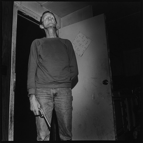
Susan Lipper recently gave an ICP audience a new reason to appreciate her photographic work.  Yes, she presented some five projects individually—starting with the posed 1983 portraits of fellow Yale art students and ending with her new installation of video portraits from Grapevine, West Virginia, juxtaposed against small  black and white landscapes of wilderness. In between, were Lipper’s seminal photobooks Grapevine (1994) and trip (2000) – a collaboration with the writer Frederick Barthelme.   Continue Reading More »

You Got Schooled by DCKT!

by Amanda Schmitt on March 11th, 2010

Andrzej Zielinski at DCKT Armory Show Booth

Dennis Christie and Ken Tyburski of DCKT gallery blew everybody out of the water last week at the Armory Show 2010 on Pier 94. First of all, those guys are amazingly productive, even outside of the Armory Booth: a) since the gallery lies a few doors down from the New Museum on the Bowery, they’re open every day of the week (in order to accommodate both the museum crowd, and the crowd that goes to the museum while it’s closed and turned away), b) Ken and Dennis are die hard and always working it behind the desk (I still have never seen an intern), and finally c) they curate a rigorous schedule of exhibitions, most often including a second project in the back of the gallery. Jumping back to the booth, this last week at the Armory, the dynamic duo planned on 4 different exhibitions in 5 days!

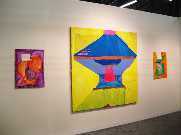
The artists on view this week all share one dominating characteristic: seduction. Seduction through color and texture, through mystery, and through the enticement of a woman. The booth is quaint and handsome, somehow the perfect size to house exhibitions by five of the gallery’s artists. On Wednesday, Cordy Ryman threw his last name out the window with his colorful, densely textured, block paintings – so chunky they might be sculptures. One multi-paneled baby blue piece began as a painting on the wall, and smoothly transitioned out onto the floor. Other works rested firmly on the booth’s wall, or stood coolly in the corner. On Thursday, Andrzej Zielinski’s candy-coated fluorescent paintings assaulted the eye with color. The pieces radiated light, and emitted some sort of happy gas, putting a smile on my face.

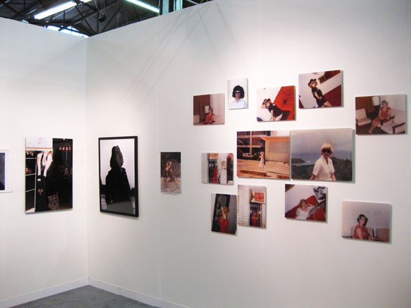
On Friday, I was able to access an art fair version of DCKT’s most recent show at the gallery, a photographic essay by Zoe Crosher. The viewer (voyeur) is allowed into the private life of Michelle DuBois during the time while she was living around military bases in the Pacific Rim during the 70s and early 80s. We see Du Bois, a prostitute, posing for pictures taken by unknown photographers (her clients). Evidence that DuBois was a playful prostitute, she dresses up as a cavewoman, a cowgirl, secretary, or anything else that could set her off giggling, as she often is seen doing in the photographs. Most notably, she is consistently confident, sexy, and proud of her womaness, rather than the contemporary idea of a prostitute (the kind most often portrayed on crime dramas) as weak and ashamed. In these various bedroom scenarios (although, she is always full dressed), DuBois comes off as coy, rather than scandalous – an innocent girl rather than a provocative temptress.

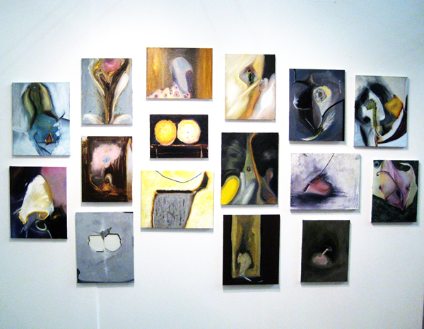
On the fourth day, Ted O’Sullivan was introduced to the booth. Throughout the installation of over a dozen dark, sexy paintings, the viewer’s eye jumps from genitalic focal point to genitalic focal point. One canvas looks like a murkier version of a Peter Doig butterfly, floating not in real space, but perhaps through a grey, foggy camera lens. If Tim O’Sullivan’s paintings had a smell, it would be musky. On view throughout the five days of the Armory Show was a table by Ryan Humphrey, a chaotic array of wooden wheels placed under a glass tabletop that proudly shouts their brand of extreme sport: skateboards, BMX, and so on. Accompanied by four fluorescent, exotically patterned chairs, Ken and Dennis were able to sell in style.

On top of the quality of the artwork, the gallerists have installed, destalled, and installed without flaw. There was no evidence of hardware, paint splatters, spackling, or nail holes from missed measurements or hurried installation. One could not even see their tools or packing materials lying around. With the fair running nine hours a day, with various events in between, one wonders if Ken or Dennis slept at all last week! I can imagine them frantic and bustling all night long installing the next day’s show and packing up the previous day’s show, yet still presenting themselves as cool and calm – and stylish might I add – during the course of the day. Now the Armory is over, and I can guarantee that they are back at work, tending to Josh Azzarella’s solo photography exhibition and already planning for the next one.

Zoe Crosher at DCKT Armory Show Booth

Ted O'Sullivan at DCKT Armory Show Booth

South Bronx Shows How It Is Done: Creating Community Through Art

by Gabriella Radujko on March 11th, 2010

El Museo del Barrio hosted a panel discussion on Wednesday, 3/10 as tribute to the conclusion of BBBP, the Bronx Blue Bedroom Project.

Many participating artists attended, including Matthew Burcaw, who also wore a curatorial hat during the two years the Blue Bedroom served as an unconventional community art space.

The robin blue “space” was the bedroom of Mexican-American artist Blanka Amezkua who made her bed scarce when receiving visitors coming to see the art installations, which changed each month. Through the use of such an intimate place, she accomplished two goals simultaneously. First, she created a haven for artists to exhibit their completed work or create site-specific work for the immediate, surrounding community, better known as neighbors. Secondly, she gave artists with no previous show experience the encouragement, AND the opportunity to present their work to the public for the first time.

As measured by the packed house and enthusiasm of the audience, BBBD successfully crossed multiple cultural boundaries to create an impact on a community. Moving forward, Ms. Amezkua expressed an interest in getting out of the bedroom and taking her project to the street. Given her huge success in the Bronx, crowd control may be an issue next time around.

Read more on the closing of the project, known as “Blue Was Never My Color, Anyway!”

Megawords Wall at Printed Matter

by Helen Homan Wu on March 10th, 2010

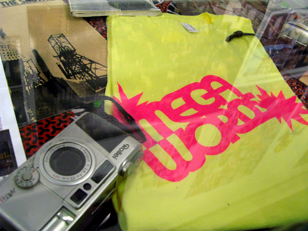
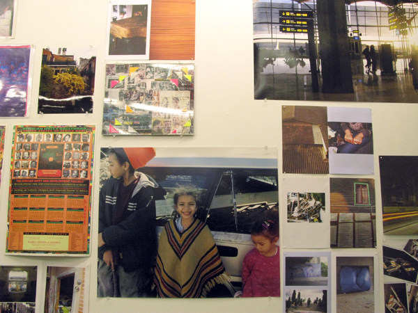
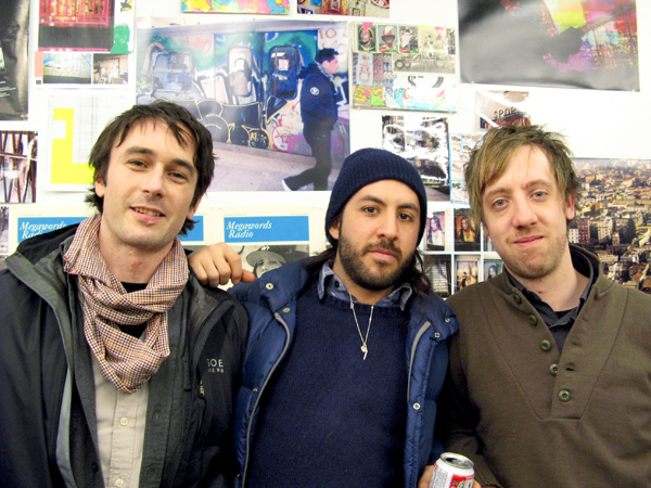
Megawords magazine is produced by Anthony Smyrski and Dan Murphy.  An attractive little mag with more photos than words.  The opening party gave me another excuse to visit Printed Matter.   Here are the boys, and apparently they all grew up in Philly together.  Check out the zine at megawordsmagazine.com

Scope NYC Recap Photos…more to come

by Helen Homan Wu on March 5th, 2010

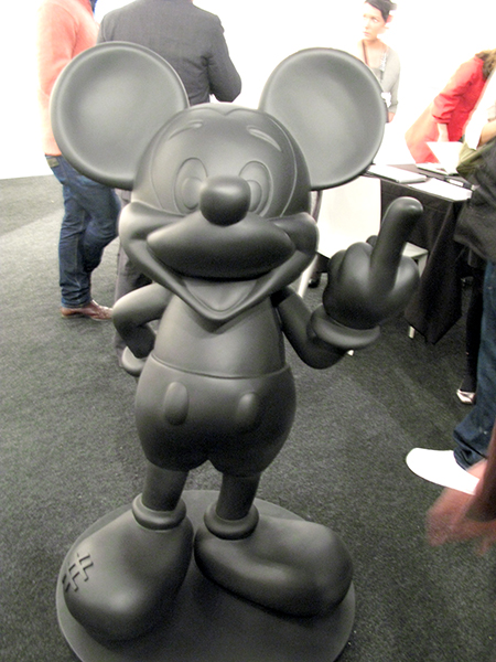
Just a quick post on Scope Art Fair.  Didn’t join Morgan on his tours, but did get a chance to see some art on opening night. Bumped into some friends and familiar faces.  It’s the first day, so everyone is still looking good and fresh!

(image courtesy Anonymous Gallery)

(image courtesy Anonymous Gallery)

Armory Arts Week 2010 Special Coverage

by Morgan Croney on March 1st, 2010

Artcards provides special coverage during Armory Arts Week this year.