[ Content | Sidebar ]

Archives for April, 2010

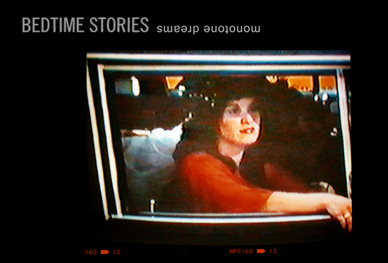
BEDTIME STORIES monotone dreams

by Helen Homan Wu on April 27th, 2010

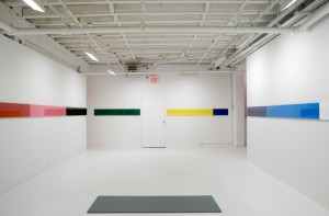
A group exhibition featuring six young female artists from around the world, Bedtime Stories monotone dreams is showing at the artist collective space The Fardom from April 9th to May 2nd, 2010. The concept of the show was to manifest the moment that exists between sleep and wake states of mind. It was interpretted in all different ways by the artists and the works they chose to represent the idea. This is the latest curatorial project that I’ve been working on, and there is still one week left before the show closes.

Artists include KATJA LOHER, SOL KJØK, CHAW EI THIEN, CARISSA PELLETERI, KELLY STURHAHN, ALIONA YURTSEVICH

Facebook comes to Artcards

by Morgan Croney on April 23rd, 2010

Artcards is beta testing a new commenting feature from Facebook. The comments will appear both on Artcards show pages and Facebook along with the commenter’s name and profile picture.  The aim is to widen the discussion to more people in a credible way.

To post a comment on a show, find the show on the main events page or on the ongoing shows section if the show has already opened. Then click on the “comment” link at the end of each show listing.

Below is the most recent activity. More updates to come soon!

No More Tic, No More Toc, the new sound is hmmmmm…..

by Gabriella Radujko on April 19th, 2010

No More Tic, No More Toc, the new sound is hmmmmm……these are the three bursts of text from a Times Square marquee captured in Louis Fauer’s recently discovered 1960’s film, Time Capsule.   Four panelists conceded that his mindset was decidedly that of a photographer shooting stills. Present were Vince Aletti, critic and curator, Deborah Bell, Deborah Bell Gallery, Howard Greenberg, Howard Greenberg Gallery, Brian Wallis, Chief Curator, ICP, and moderator Lisa Hostetler, Curator of Photographs, Milwaukee Art Museum.  

The ICP-hosted panel discussion coincided with STREET SEEN: The Psychological Gesture in American Photography, 1940-1959, being exhibited at the Milwaukee Art Museum through April 25, 2010.  The exhibition, according to Ms. Hostetler, makes “public use” of the space we call the street its subject, focusing on the role of the unconscious and the subjective experience, not the street itself.  

In addition to screening the film, made in an era when filmmaking was still not considered an art form, panelists described why American photography in the 1940’s and 50’s, specifically the street photography of Lisette Model, Robert Frank, Louis Faurer, Ted Croner, Saul Leiter, and William Klein looked the way it did.  

Several clues were given.  It was a time when photographers held day jobs with magazine publishers, one of the few places where photographers found employment.  Deborah Bell spoke to the high status accorded photographers whose work appeared in Harpers Bazaar or Flair, and the role magazines played a role in helping photographers transition their work.  Also, the “impulse to create books was missing”, according to Aletti, as was a market for photographs, let alone the galleries to exhibit them. Brian Wallis suggested how, with time, images become “something other than straight journalism”, citing Capa’s “slightly out of focus” style which created interest. 

But it wasn’t until the 1970’s that the credibility of photography hit stride, Hostetler added. 

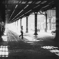
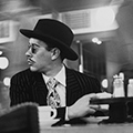
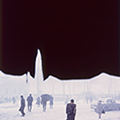
Photos top to bottom:  Lisette Model, William Klein, Ted Croner, Saul Leiter

Exit Through the Gift Shop – a Banksy film

by Alex Staiger on April 18th, 2010

Exit Through the Gift Shop – a Banksy film

Thinking I was about to see a documentary on Banksy, I eagerly attended the Los Angeles preview on April 7th.  To my surprise and delight Exit Through the Gift Shop was a rolling conversation on the art market, celebrity and playing the role of artist demonstrating social networks and communal environmental interactions.

Exit Through the Gift Shop is the first feature film by Banksy  ‘`a the story of how an eccentric Los Angeles based French shop keeper turned documentary maker attempted to locate and befriend Banksy whilst in the end only to have the artists turned the camera back on its owner’

The highly clever, elusive Banksy turns the camera onto his filmmaker Thierry Guetta who had unrestricted access to Banksy world of graffiti art and the world it commands.  By asking Guetta to make a documentary is a matter of trust allowing  him access  into his secret world.

One of the many comic points in the film is when a door opens to a room filled with a massive amount of videotapes Guetta had collected over the years of documenting graffiti in action. Guetta was supposed to be producing a film about graffiti art and the parameters in regards to that but instead he culls the footage into this awful trailor type film  that documents nothing on Banksy but instead uses all the effects in Final Cut Pro possible.

Taking command and reconverting the situation, Banksy in turn tries his hand at making a film.  Banksy and Guetta swap roles.   The artist asks the filmmaker to take on the role of artist while Banksy becomes the filmmaker.

The DIY aesthetic: Banksy and Mr. Brainwash

A successful artist takes on the  right balance  mix of the  ingredients

How to create press and luck: being at the right place at the right time

Knowing how to market an event

Hype and humor:  the translation to LA

Real art vs. the art market

Feeding frenzy

Banksy

What does it take and who is marketing it ?

Banksy is on the cover of the LA weekly  this week.

In regards to seeing the premiere, it was a closed hush hush event leaving me lingering and wondering

I didn’t know where the screening was till the morning of.

Banksys’ show in 2006 in Los Angeles  Bareley Legal was  attended by many  Hollywood  celebrities.  75,000 people  were in attendance in merely 3 days. He includes the literal tongue in cheek joke of the pink elephant in the room and that is what he shows the  press covering in Exit through the Gift Shop.

Mr. Brainwash

Mr. Brainwash’s show concerned himself with the hype.

Banksy mocks the people in line at the Brainwash show

to make it meaningless exactly what Hollywood does and Banksy showing Hollywood the DIY marketing  is ultimate validation for Banksy and ultimate validation is exactly what Mr. Brainwash was trying to pull off by having such a huge event such as his show,

Suckers buying in

Buying up the 200 pieces in Mr. Brainwash’ show

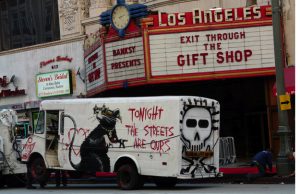
The Hollywood folks spray painting a truck outside the premiere

It takes a French guy and an English guy to mock American LA

Sociology

Interestingly enough no on in my audience at the Los Angeles premiere of Exit through the Gift Shop laughed at Banksy’s mockeries of the art crowd at both Mr. Brainwash’s and Banksy’s  show Barely Legal.

Exit Through the Gift Shop illuminates both Mr. Brainwahs’s show and Banksy’s Barely Legal raising the question Art is a joke?  or the joke is on us?

A strong work of art is one that leaves you questioning while raising questions and is still open for interpretation on many levels and layers and fits in to  all.

Banksy creates his work out of belief while Mr. Brainwash absorbs his environment and is seeking valuation. When asked in the movie  “Is this what you do for a living?” Thierry answers  “It’s my passion I live for my passion “.  He is passionate enough to put his home and equity and  security of wife and children on the line to produce his show.

He raises the questions is Mr. Brainwash being brainwashed or is he brainwashing the public?

It’s all about the reaction

Audience reaction

Endurance art without the authenticity?

Trying to create a reaction without the passion.

The goers  outside Mr. Brainshwash show being interviewed: Not even knowing why they are there. being brainwashed by him or by celebrity culture?

Trying to grasp a hold of something ….

Thierry employed 20 people to produce his his event as well as the art makers of his  200 paintings and sculptures for the show.

Authenticity is cheap.

Reconfirming the spectacle

Put down your camera and become a street artist were the words of Banksy.

Thierrey changes his role after watching street art  which is a comment of artist being absorbed by the experience.

Ironically, Banksy ended up making an art star out of his previous filmmaker throughpromoting him  whereas originally Guetta was supposed to be shedding light on the Graffiti world and promoting Banksy. The irony is Mr. Brainwash’s work sells for almost double what Banksy work does these days.

Even Madonna, who also knows how to market and hype  jumped right in on this spectacle and had Mr. Brainwash do the cover of her  Celebration album.

Superimpose yourself and disseminate

Artist as entrepreneur : the DIY aesthetic is highly profitable when you know how to command attention

Real power from perceived power to attract attention by remaining elusive and  attracting attention to the film.

An artist’s translation of documentary into biting sarcasm of the joke is on whom?

Subverting reality on one hand but making it public on another

The question remains what are you after?

Performance Spectacle: the main event

Private preview of Exit Through the Gift Shop Los Angeles Theatre April 12th

The stage: downtown LA

The Hollywood film world stands about

Camera flashing on red carpet

Like a disco ball

Performance spectacle

Free drinks and popcorn

Cocktail servers in flapper outfits and ski masks

I went back for second time not for the film I went for the spectacle of the crowd through the eyes of a performance artist in the role of editor

Learning and absorbing as I still find myself pondering the title

Black guy in black thin framed glasses in 70’s striped robe  taupe yellow and brown vertical stripes; same one as he wore a week ago at the preview

Who are you I had to wonder? and what role am I playing tonight?

The film promises an incredible insight into Banksy’s world is that why at the  screening there was double security first giving your name had to be on the guest list and then you needed a wristband once inside the theatre that no usher actually checked to see if you were wearing

Was this to ensure Banksy’s  reaffirmation that even the screening  was most definitely a circus?

Complete with popcorn but where are the circus peanuts I might ask

Old ragtime playing in the vintage theatre

Film   art    London    L.A     performance

A young male Hollywood P.A, who had just finished his first novel, asked me

“How do you feel about Banksy as an artist?”

I replied with “how does this differ from a Hollywood premiere?”

All I could think was you are now part of Banksy’s art, you are in the center of the spectacle

To command attention: keep a captive audience with green wristbands  to gain entry into this private event/spectacle screening

Myself as artist in audience of film

What hat am I wearing?

What city am I in?

and

What is this incredible connection between Los Angeles and London

Art world vs. film world

Banksy is a performance artist and his PR tactics fit LA perfectly

Putting it over the top and raising a multitude of questions

An artist is always breaking the rules and creating his/her new ones

Obey

Brainwash

Promote

By making this film Banksy is declaring street art is dead hence why we have Juliette Lewis being photographed by Pop Sugar while graffiting the truck outside the premiere.

Standing on the red carpet

spray-painting a couple of vans

to find your Hollywood glitch niche American pop up mart

In the end, I departed my first red carpet event deciding to remain elusive like Banksy.

I returned to fetch my beat up pick up truck in its $5 parking lot …tank on empty

No limo or valet for this artist

Need gas

Ironically my initials are G.A.S

Out of gas?

To see how far I can get  thus pushing the boundaries  a little further

A rat wandered under a parked car in the downtown lot

I could only think Banksy the elusive,  artist continues to reinvent himself   as magic abounds in the streets of downtown L.A.

Alex Staiger

Los Angeles Editor, Artcards

www.alexstaiger007.com

Jumpology…Jumpology….What Jumping for Joy Looks Like

by Gabriella Radujko on April 14th, 2010


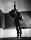
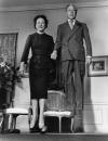
What do Richard Nixon, Marilyn Monroe, Brigette Bardot and the Duke and Duchess of Windsor have in common? The answer is jumpology, the scientific art captured by photographer Philippe Halsman, now on view at the Laurence Miller Gallery show “Jump” through May 28, 2010.  It is the first time the series has been exhibited in New York.

In addition to the 101 Life magazine covers to his credit, Latvian-born Halsman boasts a 37 year collaboration with Salvador Dali which is captured in the 1949 Popcorn Nude, one of the show’s most gravity-defying images featuring popcorn, nude model, and baguette in mid-air, Dali himself propelling the explosion of popcorn by kicking a bread warmer.  The innocence and spontaneity of the shot is contraindicated by Halsman’s demand of all of his subjects, namely, JUMP!

Artcards learned that Halsman hired his future wife, Yvonne Halsman, who printed many of the works shown, as an apprentice in an attempt to get rid of the competition, “by hiring them” according to one of Halsman’s daughters, Irene,  who was present at the opening.  Additionally, she noted that Einstein and President Roosevelt’s wife played critical roles in helping Halsman immigrate to the States. 

“Capturing the essence of his subjects’ character” is what Halsman’s daughter  was most intent on highlighting as the significance of her father’s work.  While Halsman indicated that “the jump denotes a lack of ambition and sensuality”, it’s a characterization that is more a reflection of his singular ability to persuade the most conservative of adults to show the camera what inhibition or joy looks like.

Interview with Egan Frantz

by Amanda Schmitt on April 13th, 2010

Amanda Schmitt begins this interview series with a highly intellectual conversation with Egan Frantz, whose first New York solo exhibition is currently on view at Cueto Project.

Revision 1: All Quiet on the Western Front. What a heavy exhibition title! It is loaded with various allusions and pre-conceived connotations, yet the “Revision 1″ addition leaves everything open and unexplained. Now, to be honest, I have never read the novel nor seen the film adaptation, and my knowledge of this story extends to what Wikipedia and imdb.com have provided me with. Can you please give me, in your words, a brief, objective summary of this novel?

Most people I have spoken with, having read the book/seen the film(s) or not, come to the exhibition knowing there is this war story. In this regard the title carries a kind of automatic weight which I hoped to set against certain lightness. The exhibition is situated on the western front of Manhattan, or, almost, it’s up against the West Side Highway. Before anything, one feels a breeze of speeding vehicles… I find a certain humor in this. As metaphor the title might suggest a certain silence in the history of western thought, and it is important for me that all this can all happen before opening the door or having never opened the book. Inside, the music sounding from the back room of the gallery is always present, perhaps to the point of being aggressive. If you really want to sink your teeth into the footnotes, the introduction of ’silence’ came only through the novel’s subsequent translation into English. The original German title, “Im Westen nichts Neues,” makes no mention of silence. There is then this idea of a continuous project, rephrasing or translation in “Revision…” The title points both inward and outward, locating the textual and the ‘non-textual’. Or you can just walk in you know?

I really want to make work that can be read on its own terms at the same time offering itself to some potential, persistent reader. The novel itself is a kind of educational shoe… me and my friends read it growing up… My good friend Luca Dellaverson can recite the preface off the cuff:

“This book is neither an accusation nor a confession, and least of all an adventure, for death is not an adventure to those who stand face to face with it. It will try simply to tell of a generation of men who, even thoughthey may have escaped shells, were destroyed by the war.”-Erich Maria Remarque (1928)

This exhibition is very visual…it requires a lot of effort on the eyes. There is one section that blasts club music, yet, because of the bright lighting and lack of other bodies, doesn’t make me feel like dancing at all. How do you feel this noise may or may not affect the way the viewer interacts with the framed pieces on the wall? For me it was unsettling, and made it difficult to concentrate on what I was looking at. In fact, I felt a little confused. What are these numbers? Why am I not able to discern any recognizable figure within this field? Did the bass from the amp jumble up the printed numbers on the paper so that they are now scattered and crooked? Are these two separate pieces that happen to be in the same room, or is this a cohesive installation?

The work you are referring to is 13 Figures and K.I.T.T.Y. Jam, an installation which I like to think of as playing “call and response” between this amazing Eddie Def electrofunk mashup and my 13 figures. A “jam” is what we used to call an old school hip-hop track, and it also brings to mind fresh-fruit preserves (FRESHHH – remember that sample?) which are, of course, “mashed up.” Language or ‘that which is received’ is the generator here and always in my work. I might also just say I like the way Eddie works with constraint at the same time keeping things totally wild, in outer space. My decision to make 13 works using only the numbers 1-13 comes from a similar impulse.

Within the larger context of the exhibition the way the audio travels around the space does something very important for me – it’s like seeing through walls – which is to supply a connective tissue between each and every work in the exhibition.

Please tell me more about “MK, PK, LK, LLK, C, M, LC, LM, Y,” a piece that is visually compelling and surprisingly seductive. What printer did you use? What kind of paper is this? I understand that you used CMYK cartridges, correct? What was the exact model? Also, how many cartridges did you have to go through for each piece?

I have an Epson Pro 3800, the smallest version of their large-format printers. It uses the same inks as the big ones but is only 17 inches wide and fits in my little Chinatown studio. The engineers at Epson designed a palette based on CMYK with steps in between. I simply command the printer to print each value, the thing is, the printer mixes nearly all the inks to produce each figure. If it looks like an attempt to deconstruct the inkjet image, it is just that, an attempt. It only feigns its own success as some kind of exercise in purity. They are printed on a paper made by Ilford called Galerie Gold Fibre Silk and I made the entire work without swapping cartridges. If you like the piece formally, props to Epson and Ilford.

I LOVE the piece formally. I am a CMYK-LOVER. Props to Epson and Ilford! Material is clearly important to you. The description of the medium for each piece on the checklist goes on for several lines. Some artists just opt for “mixed media.” Why is your work not just “mixed media”?

Trained as a photographer in school I was led down a particularly Barthesian path. In Camera Lucida Barthes comes to many things, one of these being that every Photograph is a certain proof, “like the delayed rays of a star.” This might not be the case for inkjet prints, which are produced by something more like a painting machine than any assortment of darkroom (chemical / light) processes, but I’m not lost on this. I use materials as proofs towards a kind of mute speech via their associative qualities or the way these things sound or look in language itself. The materialist lists / titles are tools to get into the work. They also make very clear the impossibility of a complete description. Jared Madere has nice way of putting this, “I don’t say whether or not my window was open when I made the work.”

As in Petroleum Pictures, we are told that the plastic parts come from Canal Plastics Center. What if they had been mail ordered? Would it not be the same piece to you? As for the piece in the center of the room, made with 18% reflective middle gray book cloth, how would the piece change if it was 81% reflective?

I have a nice anecdote to get somewhere close to an answer. The nice girls who work at the gallery were getting really tired of the music which plays rather loudly 10am-6pm, 5 days a week. I wanted to make some sort of gesture to express my gratitude to them, so the next day I went to Canal Rubber (just down the block of Canal Plastics), bought some acoustic foam, that I later cut to the same size as this middle grey stage you were describing, before swapping the former for the latter. The Petroleum Pictures room is situated between the 13 Figures… and their respective desks. Of course, they’re still dealing with music, but surely the acoustic foam is sucking up some sound on its way over! I’m especially fond of this move for the way these two rooms, when taken together, present a kind of aporia — one projecting and the other sucking.

The Sidesteps series were made by taking a squeegee to freshly printed digital images, however they very much have a “darkroom” quality to them. They remind me of Wolfgang Tillman’s photographic abstractions, made by manipulated photo chemicals directly onto the paper during the development process. How did you come about making this series? What it a happy accident or a calculated, conceptual process?

For me and many others the word ‘conceptual’ is bound up with a specific historical moment, that is, ‘conceptual art,’ and I think it functions best this way, as descriptive of a moment in time. I make use of systems to get myself out the work and avoid making too many arbitrary decisions, but, when making objects, it becomes increasingly clear how pathos continues to creep in. The late Jack Spicer has this character called Lowghost who is often creeping into his books. I like this idea of logos as a kind of gremlin in his work.

Regarding the Sidesteps, there is a lot of information this work (it is an ongoing project) which I could easily go on listing. Lately, I’ve been interested to see how the sequence functions without my voice all over it. The tools are there in the titles, materials, numbers, sizes, etc. As far as process goes these things are very simple. Using a squeegee has nothing to do with some sort of affinity towards the tool and the result it produces. It’s a matter of treating the inkjet print like its gelatin silver predecessor. Treating one object like another – this is key. In the darkroom one would normally squeegee their prints in kind of final gesture before laying them out to dry. I use this same squeegee and do the same thing when a print comes fresh out of the inkjet printer. Naturally, this produces a distinctly different result every time, so as R.H. Quaytman likes to say, “to pierce the ego of their singularity,” I repeat this process 11 times and display each result.

It was the image I used for the first sequence Sidesteps (source: chaos_and_creation.jpg) that was helpful in determining the system I continue to use. I used a still from a video in which Dali is having an argument with Mondrian about pure ‘painting’ vs ‘corrupted’ painting… I wanted to pull this whole idea to the side. In doing so I ended up making a kind of horizontal move into painting myself.
Let’s talk a little bit about “Untitled…” (the one made out of PMMA). This work can read in many different ways; it is a different piece each time a different person views it. This here is a fact, since the reflection changes with each new body that stands in front of the piece. Now, the viewers can be grouped into two categories: those who look atUntitled… and see through the first layer of PMMA and try to look at the interior of the three-dimensional object (a sculpture), and those who look at the surface of the PMMA, ignoring the side of the box (a quasi-painting). If you had to categorize Untitled…, would it be a painting or a sculpture?

Would it be helpful for you if I categorized it?

No. That wasn’t a good question. In fact I should probably delete, but I like the moxy in your response. And no, it wouldn’t be helpful. I all for the subjective….To me, the piece is open-ended because it can be a piece about materiality, formal compositions, transparent interchanges, self-reflexivity, etc…the list goes on. Is this piece as open-ended to you as it is to me? Or rather, are you trying to communicate something specific to the audience?

Yes it is definitely open ended, at least more overtly than the others. There was a point where I was calling it “a nothing” to my friends but this went into some funky Ray Johnson territory, and I don’t want to step on Ray Johnson.

What are you Mr. Frantz, a photographer a painter? You to seem to fit in between the two. You are not taking images with a camera, or creating them with a brush, but rather a “chooser” and “manipulator” of images. You seem to control how your audience sees an image. As in MK, PK, LK, LLK, C, M, LC, LM, Y, we are looking at pure color, yet that color, or image, could have come from anywhere! The MK could be a microscopic view of someone’s black tuxedo, or a macroscopic view of the night sky. Or perhaps, it is just ink on paper. Or in Remarque, Erich Maria, you present the viewer with a photocopy of a photograph. Would you reject my assumption that you are a curator of images? Are they YOUR photographs, or do they come from somewhere else? Are your manipulated inkjet prints your paintings?

I was recently invited to participate in a book project happening out in LA. Shortly after confirming my participation they sent out of PDF list of participating artists. In that list, it says Egan Frantz – Painter. The function of a curator is so contested these days I’m not sure what you mean when you ask if I consider myself a curator of images. I can tell you that if there is any one object I have a particular affinity towards it is the radio. I would really like to be a radio, to transmit that which comes from the outside, and do this very well!

You know, my brother, a nuclear engineer and an avid logophile (lover of words and definitions), loves the fact that I describe myself as a curator. Before looking it up in a dictionary, he didn’t know what a “curator” was. And now, to him, I am “an ecclesiastic entrusted with the cure of souls.” Basically what I’m trying to say is that although there may be a definition in Webster’s, the term is as you said, highly contested and absurd. ???To wrap things up, how does Revision 1: All Quiet on the Western Frontrelate to All Quiet on the Western Front (your first solo exhibition)? Will there be a Revision 2?

I can’t say if there will be a Revision 2 but surely the next exhibition will function that way – as a continuous revision of what is already out there. I came to Revision 1 for a number of reasons, one being that I had had my undergraduate exhibition at Hampshire College a little less than a year before and still felt that I was sweating out a number of the same problems. A good deal of this show is comprised of things I made in school, which is a nice glance back to this narrative of school boys in Erich Maria Remarque’s novel. It is my hope that through these exhibitions I’ve built something like a solid stage. If this is true, the next thing I should be able to do is walk all over it.

Right now I’m really excited about the Guatemalan writer Augusto Monterroso. Some of his stories are as short as one sentence as in The Dinosaur, “When I woke up, the dinosaur was still there.” This little structure is endlessly playful. Again, we are dealing with a translation and in this case the “I” is interchangeable with “he” and “she”. I have a pretty intense relationship to sleep (I sleep more than any one I know) and I am still something of a bedroom artist (I share my studio with my bed), so, yes, something along these lines is happening for me…

Mike Nelson’s Quiver of arrows – Lost in Translation

by Brent Birnbaum on April 13th, 2010

If you didn’t make it to Mike Nelson’s show at 303 Gallery before it closed this past Saturday, don’t sweat it. Perhaps you recall this British artist’s masterpiece, A Psychic Vacuum, from the fall of 2007 at the old Essex Street Market. A scaled down version of this, shoved into a gallery, does not work. I was fist pumping my way to witness where this amazing artist had taken his work in the last 2-1/2 years, only to be extremely underwhelmed.

Four Airstream trailers dating from 1939 to 1968 were connected (via parts of a fifth trailer) into a square formation. Up some wooden stairs was the lone entry point. You could navigate through all four at the same time and return to your previous spot. Nelson addresses American history through the romantic ideals that were marketed and embedded with the futuristic Airstream, while questioning where the American dream is today. We know the answer to this question before walking into the gallery. Yeah yeah, America sucks, war sucks, we get it. An unexpected approach or interesting perspective to this Goliath subject was not achieved at 303.

Ducking your way through the trailers reveals the artist’s heavy-handed placement of objects. A Vietnam veteran T-shirt, a book titled The Spectacle of Death, an Islamic poster, and toys referencing cowboys and Indians are a few of the scattered items. The sense of abandonment from the forgone trailers was overshadowed by the forced fake relics off the United States list of world blemishes. Granted, Mike Nelson’s block size installation is hard to top, but “Quiver of arrows” was obviously the prequel.