by Ryan Sullivan
on February 12th, 2010

Contemporary art frustrates a lot of people. One common complaint is artwork seems to be trending towards awkward, messy, simple, and ugly art. This viewpoint may stem from seeing artwork with forced naivety in tired, derivative ways; however, when naivety is genuine it is absolutely charming. So when we all received a surplus of free raw material on Wednesday it was refreshing to see everyone get into the game. Perhaps part of the trend in art today is the intention to keep this spirit in high regard. Click below to view more images of McGolrick park in Brooklyn — a micro cosmos of the art world:
Continue Reading More »
Comments closed
by Helen Homan Wu
on February 12th, 2010
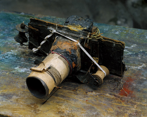
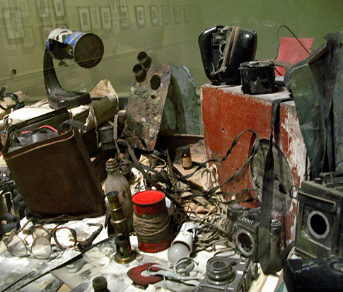
(above: courtesy ICP)
It’s been awhile since I’ve been to the ICP, but what attracted me to visit was this camera made completely out of cardboard and held together with household items. It is the work of the Czech photographer Miroslav Tichý in his debut show in America. Although I was not familiar with his name, his body of work – mostly black and white silver gelatin prints – filled up the entire ground floor of the museum. Where did this artist just pop up from? It almost seemed like someone had dug it up from somewhere. Most of the prints are in poor condition, over or under-exposed, and spotty. As I went deeper into the exhibition I’m starting to understand the artist more. He obsessively photographs women, usually of their behinds, while probably following his subjects from what the viewer can see. But what amazed me is that the cameras he used were all self-made, because he was poor and for aesthetics reasons.
Nowadays all our devices are tuned to be crisp and seamless without room for mistakes. After seeing the non-chalance in Tichy’s work, so intimate and personal, I start to appreciate all the uncalculated mistakes. They become almost poetic and dreamlike. Behind the glass showcases you can see the evidence of all the gadgets of his time that suggests his experimentations. This is where you can get lots of ideas for homemade image-capturing devices. I wonder if he took it to the next level and made moving images out of a cardboard box.
Comments closed
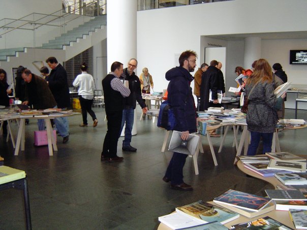
by Gabriella Radujko
on February 10th, 2010

The Art Book Swap New York at MoMA blended noble intentions with fun and ingenuity.
NADA and Regency Arts Press, Ltd. sponsored the event on Saturday, February 6, 2010, from noon-5pm. What’s this all about and how is it done, you ask? Keyword answers are free books, simply, and effortlessly…bring your art books and swap them for the same number of art books donated by others. “Others” included New York City art galleries, the MOMA book store, plus folks who attended the event and donated books from their personal libraries.
“…remaining books are donated to prison libraries…”
Perhaps a few examples of titles that one of our contributors from Artcards.cc swapped would illustrate why this was such a worthwhile event:
George Condo: Existential Portraits
Adam Fuss: Photograms of Life and Death
Rudolph Burckhardt: An Afternoon in Astoria
Amy Cutler: Paintings and Drawings
Artists’ Sketchbooks: 1st exhibition catalog for Matthew Marks’ new gallery (1991)
Lighthouse Series I-XIV by Helen Frankenthaler
Excellent titles, yes, but more importantly, the event promoted the discovery of titles and/or artists that you might not have previously had an inclination to learn more about. Discovery, yes, that is why this art book swap was so engaging.
Do not miss the next event! It will take place in another U.S. city yet to be determined. See www.regencyartspress.org for more information. Many thanks to the MOMA staff for their help and enthusiasm!
Comments closed
by Peter Neofotis
on February 10th, 2010
The New York Society of Women Artists
The Meaning of the Line Exhibition
February 8-28, 2010 @ The Broom Street Gallery
Some Serious Ladies Show Their Works
In a artistic climate in which one walks into “hip” contemporary art galleries often feeling that they have encountered “civilization at the end of its tether,” it is refreshing to find a group show in which the participants are not only able speak to the current times, but also display technical skill. The New York Society of Woman Artists’ The Meaning of the Line which opened February 8th and runs through the 28th at the lovely Broom Street Gallery contains some such wonderfully inspired works. And as a whole this ensemble should be commended for veering away from the sensational, and displaying sometimes humble, sometimes quiet works which hold a great power and resonance.
There are the deceptively simple acrylic paintings of Gloria Schar, whose Cooling and Reds and Purple have a Rothko style, but instead of using the swaths of color as imposing forefronts, she casts the colors as seeming shadows to some home in our memory. And Tina Rohrer’s uncanny Accent Aqua III and Blue/Green Progression are series of green shades checkerboards that elude both to the modern world of computer mapping and code, yet create a mirage of natural landscapes. One might also spend some time contemplating Lea Weinberg’s love-filled bronze’s Whereto and Attachment. The two human sculptures are evocative of geological formations, formed by a miraculous wind or water.
Another very worthy composition is that of Diana Freedman-Shea, whose Dusk: Long Island City Winter uses almost translucent oil paint and sometimes even just-outlined figures to capture the feeling of those shortest of days. Despite her dreamy hues and strokes, the painting carries a deep reality; so that it is almost like an old photograph. Inviting you to walk into it, the painting gives one the gift of solace even in a dreary, winter day.
And one should not leave the show without spending a considerable time contemplating the profound work of Jerilyn Jurinek, whose oil Crossing the Delaware River is a profound multi-dimensional work that first gives almost geometric surface impressions, but upon time becomes deep and expansive human and environmental landscape in the viewer’s gaze. Indeed, once the painting amazingly becomes three dimensional, one is able then to understand that the colorful shapes are indeed figures on a terrifying, yet hopeful journey across a deep cold river. On one side is a silhouetted figure that almost floats over the canvas, and it is balanced on the other side by a seemingly distant moon. The painting is a daring work – a robust hybrid of abstract power and well crafted figures – combined to produce a scene filled with beauty and cathartic pain.
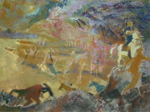
Crossing the Delaware River
Peter Neofotis
New York
February 8, 2010
Comments closed
by Helen Homan Wu
on February 8th, 2010

“Since 2003, Unsound Festival, Poland’s most adventurous music festival, has brought a bold and uniquely modern program of music to Kraków. Now, with seven festivals in their native city under their belt (and outpost events further east in cities like Minsk), Unsound is coming west to New York for their first ever North American edition. Unsound Festival New York’s mission is to forge new links between music genres, between generations and even between artistic practices. The driving force in the assembling of the New York program has been Unsound Festival’s commitment to forms of music and sound art that involve experimentation and risk. Unsound Festival has made a worldwide reputation by breaking new ground while dealing with vibrant electronic, experimental, independent, post-classical and club music scenes from around the world.”
Thursday February 4th opens an exciting series of sound, visual art and music events that has never happened in the East Coast of the States. If you follow any sort of experimental electronic music or video art, chances are you heard the waves coming. As an electronic beats enthusiast, I was extremely excited that the Unsound Festival is actually taking place in New York City. I’ve always been disappointed that the experimental electronic scene isn’t happening much here in my hometown compared to Berlin or London, but when I saw the lineup to Unsound I was more than impressed. The program boasts a nice mix of multidisciplinary art forms including electronic/post-rock/classical/neo-jazz music, sound art, experimental visuals… That is the best I can do to categorize — a lot of the work doesn’t cleanly fit into any one categorical box.
The first show begins appropriately at Lincoln Center’s David Rubenstein Atrium with an improvisational performance by Berlin video artist Lillevan (who’s also working on the Warhol Screen Tests) and Finland’s Vladislav Delay, followed by the avante-garde group Solid State Transmitters. This show was also part of the Thursday free Target shows, so the queue of people went around the block. Half of the people didn’t even get to step inside. I decidedly gave up, saving my energy for Saturday’s 8-hour long set of experimental improvised soundscapes from Group Show (Jan Jelinek, Hanno Leichtmann and Andrew Pekler).
The line-up looks like this:
2562
ACME
Alexander Kaline
Andrew Pekler
Barbara Preisinger
Blondes
Bora Yoon
Borne
Dave Q
David Daniell
Derek Plaslaiko
Ensemble LPR
Eric Cloutier
Ezekiel Honig
FaltyDL
Groupshow
Hanno Leichtmann
Jacaszek
Jacek Sienkiewicz
Jan Jelinek
Joshue Ott
Kadebostan
Comments closed
by Brent Birnbaum
on February 7th, 2010
Sterling Ruby: 2Traps
Pace Wildenstein
545 West 22nd
February 5th – March 20th
Trap number one, I fell into shortly after exiting the gallery. Do not read the press release. At the very least, wait 24 hours. The Press Release (3-stapled pages) could easily be the intro of a yellow and black book titled: Sterling Ruby for Dummies. Perhaps this is acceptable since Sterling Ruby’s crowd is growing and morphing, this being his first solo exhibition with Pace Wildenstein. One could also argue it is telling people what to think – specifically, collectors.
Now that we are thinking for ourselves, let’s get onto the artist. German born, LA based Ruby recently had a sexually charged (or uncharged depending upon how much porn you’ve exposed yourself to) video installation at Foxy Production in October of last year. In 2008 the Drawing Center showed approximately 50 works dating back to 2003; while Metro Pictures simultaneously showed his ceramic-based sculptures. Sterling is also known for his monolithic Formica and stalagmite structures. Given the space allotted at Pace and a diverse practice to “draw” upon, the stage was set for Ruby to impress. The hype garnered did not compare to say the recent Urs Fischer New Museum show, but unlike Urs, Sterling delivers. He actually parks one sculpture, titled BUS.
The two sculptures in the exhibition both measure 10’ x 9’ x 40’. BUS is an old bus turned sculpture with steel cages inside and an extravagant looking sound system in the rear. The viewer is left to wonder whether sound emits from the work. The “Cliff’s Notes” on hand fail to mention this important detail. The other gigantic work, PIG PEN, is comprised of steel cages. It is a modular grid built with metal security doors. Unlike BUS, you can not enter this sculpture. The desire to attempt to navigate the impassable work is stronger than the satisfaction of walking through BUS. Sterling is operating on multiple levels at the same time, keeping your mind bouncing in between the 2 pieces. He couldn’t have one successfully enter our realm without the other. The artist is deconstructing familiar objects while simultaneously constructing new ones. We are left with new allegories to mediate on. In tandem, 2TRAPS is viscerally seductive and will linger with you long after you exit the gallery. Go park yourself there and think about what you would write in your yellow and black book.
Comments closed
by Brinson Renda
on February 2nd, 2010
Oh Art Basel, you came and went… we scurried like ants searching for the next delicious sugar cube, trampling those that were in the way just to get our fill. It should be considered an extreme sport to be able to soak in the entire over saturation of art that spills into the streets of Miami Beach for those few days… drowning most. There are many established galleries, specifically in the Wynwood Art District that embrace the flood of art lovers, gallerists & critics alike each year.
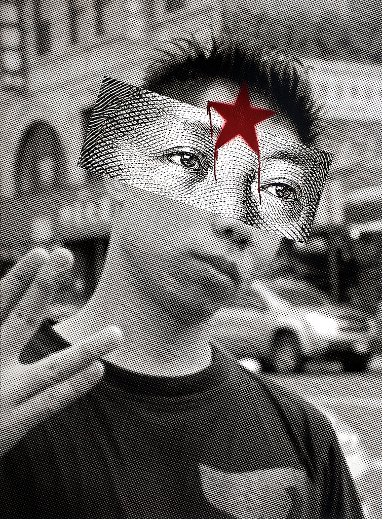
One of the newer galleries that surfaced out of the chaos was next door to mine named after the artist & owner: Claudia Calle. She is an emerging artist whose discipline is photography and mixed media with a background in advertising. Setting up for Basel the month prior, I spent a lot of time getting to know this new artist & the body of work that she was debuting. The series that caught most of the attention from the public was “The Republic of China,” a propaganda based series with each detailed print displaying quite the pregnant moment. I am personally drawn to propaganda imagery due to its reflection of a society’s issues with the sarcastic overtones & half-truth twists.
She told me that when she visited China, she began to realize the impact the ‘West’ had on the once traditional based culture.
“More and more Chinese people are adopting our Western culture, forgetting their ancestral heritage and methodologies. They dream of buying new cars and wearing foreign clothing brands; now they not only produce these products, they want to buy them too. The illusion of progress is changing their “Long life” for a lifestyle that is short, solitary, unhealthy and stressful.”
I agreed; the rapid growth (economically speaking) is growing at an exponential rate and is simultaneously creating a new social class. The rise of this new working class reminds me of the French’s 18th Century ‘le petite bourgeoisie.’ Her work sort of harks back to 18th Century Orientalism too, but with an obvious update to meet today’s pop-culture symbolism that is displayed in most of her prints. Moreover, Claudia’s perspective has translated this matter for the public in such a clear, clever & didactic way. Keep an eye out for this artist and visit her site or gallery to learn more.
>>>Wynwood Art District (2722 NW 2 Ave)<<<
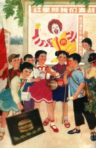
‘MacDonalds [1]‘ – Propaganda Series from “The Republic of China”
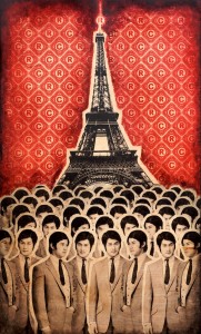
‘Francia’ - ®egister / ©opyright Series from “The Republic of China”
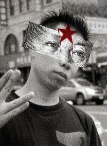
‘Mao [1]‘ – Mao’s eyes Series from “The Republic of China”

Claudia Calle
Comments closed


 RSS
RSS
