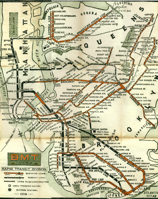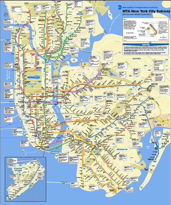
(circa 1924, courtesy nycsubway.org)
If you haven’t already noticed the MTA has just put out the new subway map to replace the previous one, which has constantly been updated for the past 10 years. This new map shows more defined routes compared to the previous map, which had a lot of unfinished business. The new map that launched this month is graphically cleaner with finer attention paid to the color scheme, although I think the bright blue is a tad loud. The New York Subway system must be the oldest in the world, you can witness this history at the Chambers Street station, where you can still feel the grit of New York’s past times. Updating the map is a sign that the city is putting an effort for these improvements, and evidently they are enhancing some of the stations, albeit at a slow rate. I think there are still lots of technological advancement that we can learn from other cities such as the London Undergound, which has a superior information design navigational system (online and onsite), and Berlin with its time table that is precise to the second, and other cities in Asia such as Tokyo and Hong Kong that are admirable for their service to riders. And perhaps even Barcelona, that gives riders an ad-free commute.
The NYTimes did a great article comparing the map of MTA’s present and past here.


 RSS
RSS
