[ Content | Sidebar ]

Archives for February, 2010

Pae White at the Whitney

by Helen Homan Wu on February 28th, 2010

image: courtesy Whitney Museum of American Art

If you’ve never seen Pae White’s work, this would be a good excuse to go see the 2010 Whitney Biennial.  Being an admirer of Ms. White’s work, which has narrative qualities combined with designer’s aesthetics, I was not disappointed at her chosen piece for the Biennial.

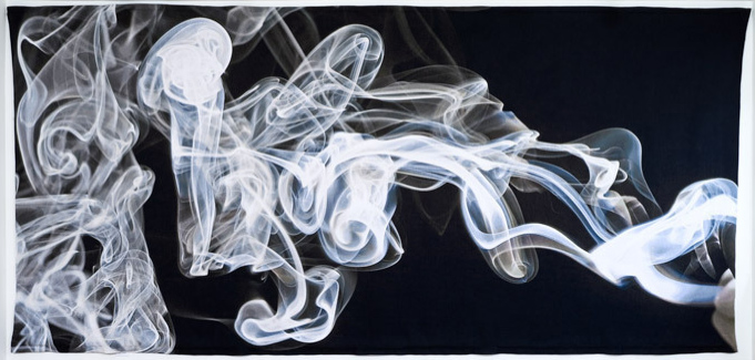
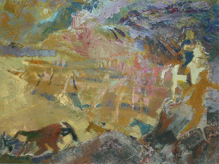
When the elevator doors opened to a huge Pae White tapestry on the third floor of the Whitney I was mesmerized. This is my first Whitney Biennial experience, I have to admit, even though I’ve been in New York most of my life. But 2010 is starting out good, as the optimistic buzz has been going around in the art world.

The huge tapestry shows a cloud of smoke, in its pure form, blown up to a dramatic proportion, revealing subtle changes in light, shadow, form containing air, and all the connotations behind it. I give respect to the curators who decided to put this piece as a greeting to an amazing show. If time allows, I’d write a broader description about the entire Biennial but I’d rather focus on one good piece: Pae White’s Smoke Knows. At first glance, you might think that it’s a painting, but stepping closer, or for those who knows Ms. White’s work, you’ll know that it’s a more complicated process.  As a huge hanging tapestry, it’s quite complicated to produce. Is there another artist out there that uses this traditional method of tapestry professionally in their work? I can only think of the stuff hanging in the Met or the Cloisters dating back to the Medieval days.

The photographic image of smoke can suggest many things, but to the modern eye it becomes an illusion, both sexy and dreamy. White describes it as the “‘dream of becoming something other than itself’ by contrasting an image of something immaterial with the physicality of fabric”.  Isn’t that the goal of being an artist?  To become something other than themselves…  As I walk past White’s smoky image into the other works, I instantly have to shift into numerous other little worlds. Although I have to say, the third floor is my favorite, I didn’t find any other pieces as strong as Pae White’s. She is brilliant in her choice of method, subject, simplicity, and finally in scale.

The Whitney Biennial runs from Feb. 25 to May 30.

“Post-Minimal to the Max,” a response

by Ben Wadler on February 14th, 2010

While having the potential to come off as a bit of a Debbie Downer, Roberta Smith contributes seasoned wisdom with traditionalist tones in this weekend’s NY Times Arts & Leisure section.

The title, Post-Minimal to the Max, is odd and misleading, so I suggest disregarding it, but the writing nicely frames the current art moment as a scaled-up rehash of themes from 70’s Conceptualism. Smith begins with a roll call of recent New York museum exhibitions (Gabriel Orozco, Urs Fischer, Tino Sehgal) and briefly laments the season’s menu as “dispiritingly one-note.” While a fan of these shows, she fears that they represent the congealing of another chapter of institutionally approved Art History (a behavior she later insists that we now know too much to repeat). While we all have our own preferences, and Smith is no exception, the article is not a critique of one vision in favor of another, but rather a concerned observation of the lack of variety in the shows that are currently on view. Absent, she notes, is an interest in the personal, and the urgently hand-made. Following this, is a reading of where we’re at, based on what’s missing. But like a doctor telling us that we need more fiber, what’s being advocated is not fiber, but a balanced diet overall.

“We cannot live by the de-materialization — or the slick re-materialization — of the art object alone.”

After all, variety is good for the art wold for the same reason that it makes for healthier DNA: regular exposure to the unfamiliar allows us to keep growing as a whole. The idea here is not that the Art world is based on the survival of the fittest (much as it can often feel that way), but rather that a diversity of visions is crucial to our understanding of the present, and also makes for a more interesting conversation. Imploring curators (the real audience of this article) to think outside of the ‘hivemind,’ she invites a larger conversation about our continued obsession with newness, nowness, and brand names. Although referring to a beehive, this potent little term also calls to mind the frenzied buzz of Wall Street, where information pertaining to the patterns of the collective are studied in order that individuals may profit from it. But whether you are a broker or a bee, your business is a working knowledge of the thing in demand, not the thing that nobody is talking about. This tendency of market economies to seek out and define a normative goal leads directly the condition that Smith writes about: a kind of aesthetic myopia where all we want to see is what is getting seen the most. This model can also be seen in everything from viral videos on the internet, to the use of algorithms developed in the financial sector to analyze (and exploit) trends in the Art market.

What gives the article its call-to-reason tone is the nature of the moment from which Smith is attempting to right our ship. Her argument is reminiscent of one recently put forth by the White House, attributing the success of Fox News to the simple fact that it is selling the clearest narrative for people to follow. So too in the Art world do we want clarity, and the more others are following something, the less likely will it be a waste of our time to do the same; at least we will have something to say when it comes up in conversation. Here Smith’s article rightly reminds us that the aim of the Arts was never for all of us perceive the same reality. We look for alternative ways of looking, or at least that’s why I got into this racket.

If, as Don Draper says, Happiness is a billboard on the side of the road that screams with reassurance that ‘Whatever you’re doing is OK,’ then surely nothing is more annoying than a Times critic who cries for a return to common sense. It is a risky position to take, as such a plea can easily make people feel judged for the fun they are having. To me it sounds like good advice though, for those in the Art world looking to move past the values inherited during the last decade’s proximity to the market.

Folk Flock to Flurry Field

by Ryan Sullivan on February 12th, 2010

Contemporary art frustrates a lot of people. One common complaint is artwork seems to be trending towards awkward, messy, simple, and ugly art. This viewpoint may stem from seeing artwork with forced naivety in tired, derivative ways; however, when naivety is genuine it is absolutely charming. So when we all received a surplus of free raw material on Wednesday it was refreshing to see everyone get into the game. Perhaps part of the trend in art today is the intention to keep this spirit in high regard. Click below to view more images of McGolrick park in Brooklyn — a micro cosmos of the art world:

Continue Reading More »

Miroslav Tichý Debuts in America

by Helen Homan Wu on February 12th, 2010

(above: courtesy ICP)

It’s been awhile since I’ve been to the ICP, but what attracted me to visit was this camera made completely out of cardboard and held together with household items. It is the work of the Czech photographer Miroslav Tichý in his debut show in America.  Although I was not familiar with his name, his body of work – mostly black and white silver gelatin prints – filled up the entire ground floor of the museum. Where did this artist just pop up from?  It almost seemed like someone had dug it up from somewhere.  Most of the prints are in poor condition, over or under-exposed, and spotty. As I went deeper into the exhibition I’m starting to understand the artist more. He obsessively photographs women, usually of their behinds, while probably following his subjects from what the viewer can see. But what amazed me is that the cameras he used were all self-made, because he was poor and for aesthetics reasons.

Nowadays all our devices are tuned to be crisp and seamless without room for mistakes. After seeing the non-chalance in Tichy’s work, so intimate and personal, I start to appreciate all the uncalculated mistakes. They become almost poetic and dreamlike.  Behind the glass showcases you can see the evidence of all the gadgets of his time that suggests his experimentations. This is where you can get lots of ideas for homemade image-capturing devices. I wonder if he took it to the next level and made moving images out of a cardboard box.

Art Book Swap at MoMA: Rejuvenating New Yorkers’ Libraries

by Gabriella Radujko on February 10th, 2010

The Art Book Swap New York at MoMA blended noble intentions with fun and ingenuity.

NADA and Regency Arts Press, Ltd. sponsored the event on Saturday, February 6, 2010, from noon-5pm.  What’s this all about and how is it done, you ask?  Keyword answers are free books, simply, and effortlessly…bring your art books and swap them for the same number of art books donated by others.  “Others” included New York City art galleries, the MOMA book store, plus folks who attended the event and donated books from their personal libraries.

“…remaining books are donated to prison libraries…”

Perhaps a few examples of titles that one of our contributors from Artcards.cc swapped would illustrate why this was such a worthwhile event:

George Condo:  Existential Portraits
Adam Fuss:  Photograms of Life and Death
Rudolph Burckhardt: An Afternoon in Astoria
Amy Cutler:  Paintings and Drawings
Artists’ Sketchbooks: 1st exhibition catalog for Matthew Marks’ new gallery (1991)
Lighthouse Series I-XIV by Helen Frankenthaler

Excellent titles, yes, but more importantly, the event promoted the discovery of titles and/or artists that you might not have previously had an inclination to learn more about.  Discovery, yes, that is why this art book swap was so engaging.

Do not miss the next event!  It will take place in another U.S. city yet to be determined.  See www.regencyartspress.org for more information. Many thanks to the MOMA staff for their help and enthusiasm!

The New York Society of Women Artists

by Peter Neofotis on February 10th, 2010

The New York Society of Women Artists
The Meaning of the Line Exhibition
February 8-28, 2010 @ The Broom Street Gallery

Some Serious Ladies Show Their Works

In a artistic climate in which one walks into “hip” contemporary art galleries often feeling that they have encountered “civilization at the end of its tether,” it is refreshing to find a group show in which the participants are not only able speak to the current times, but also display technical skill. The New York Society of Woman Artists’ The Meaning of the Line which opened February 8th and runs through the 28th at the lovely Broom Street Gallery contains some such wonderfully inspired works. And as a whole this ensemble should be commended for veering away from the sensational, and displaying sometimes humble, sometimes quiet works which hold a great power and resonance.

There are the deceptively simple acrylic paintings of Gloria Schar, whose Cooling and Reds and Purple have a Rothko style, but instead of using the swaths of color as imposing forefronts, she casts the colors as seeming shadows to some home in our memory. And Tina Rohrer’s uncanny Accent Aqua III and Blue/Green Progression are series of green shades checkerboards that elude both to the modern world of computer mapping and code, yet create a mirage of natural landscapes. One might also spend some time contemplating Lea Weinberg’s love-filled bronze’s Whereto and Attachment. The two human sculptures are evocative of geological formations, formed by a miraculous wind or water.

Another very worthy composition is that of Diana Freedman-Shea, whose Dusk: Long Island City Winter uses almost translucent oil paint and sometimes even just-outlined figures to capture the feeling of those shortest of days. Despite her dreamy hues and strokes, the painting carries a deep reality; so that it is almost like an old photograph. Inviting you to walk into it, the painting gives one the gift of solace even in a dreary, winter day.

And one should not leave the show without spending a considerable time contemplating the profound work of Jerilyn Jurinek, whose oil Crossing the Delaware River is a profound multi-dimensional work that first gives almost geometric surface impressions, but upon time becomes deep and expansive human and environmental landscape in the viewer’s gaze. Indeed, once the painting amazingly becomes three dimensional, one is able then to understand that the colorful shapes are indeed figures on a terrifying, yet hopeful journey across a deep cold river. On one side is a silhouetted figure that almost floats over the canvas, and it is balanced on the other side by a seemingly distant moon. The painting is a daring work – a robust hybrid of abstract power and well crafted figures – combined to produce a scene filled with beauty and cathartic pain.

Crossing the Delaware River

Peter Neofotis
New York
February 8, 2010

Unsound Festival – a medley

by Helen Homan Wu on February 8th, 2010

unsound festival 2010 ny

“Since 2003, Unsound Festival, Poland’s most adventurous music festival, has brought a bold and uniquely modern program of music to Kraków. Now, with seven festivals in their native city under their belt (and outpost events further east in cities like Minsk), Unsound is coming west to New York for their first ever North American edition. Unsound Festival New York’s mission is to forge new links between music genres, between generations and even between artistic practices. The driving force in the assembling of the New York program has been Unsound Festival’s commitment to forms of music and sound art that involve experimentation and risk. Unsound Festival has made a worldwide reputation by breaking new ground while dealing with vibrant electronic, experimental, independent, post-classical and club music scenes from around the world.”

Thursday February 4th opens an exciting series of sound, visual art and music events that has never happened in the East Coast of the States. If you follow any sort of experimental electronic music or video art, chances are you heard the waves coming. As an electronic beats enthusiast, I was extremely excited that the Unsound Festival is actually taking place in New York City. I’ve always been disappointed that the experimental electronic scene isn’t happening much here in my hometown compared to Berlin or London, but when I saw the lineup to Unsound I was more than impressed. The program boasts a nice mix of multidisciplinary art forms including electronic/post-rock/classical/neo-jazz music, sound art, experimental visuals… That is the best I can do to categorize — a lot of the work doesn’t cleanly fit into any one categorical box.

The first show begins appropriately at Lincoln Center’s David Rubenstein Atrium with an improvisational performance by Berlin video artist Lillevan (who’s also working on the Warhol Screen Tests) and Finland’s Vladislav Delay, followed by the avante-garde group Solid State Transmitters. This show was also part of the Thursday free Target shows, so the queue of people went around the block. Half of the people didn’t even get to step inside. I decidedly gave up, saving my energy for Saturday’s 8-hour long set of experimental improvised soundscapes from Group Show (Jan Jelinek, Hanno Leichtmann and Andrew Pekler).

The line-up looks like this:

2562
ACME
Alexander Kaline
Andrew Pekler
Barbara Preisinger
Blondes
Bora Yoon
Borne
Dave Q
David Daniell
Derek Plaslaiko
Ensemble LPR
Eric Cloutier
Ezekiel Honig
FaltyDL
Groupshow
Hanno Leichtmann
Jacaszek
Jacek Sienkiewicz
Jan Jelinek
Joshue Ott
Kadebostan