I’m trying to describe the feeling I had when I first met Santiago Taccetti and saw his artwork. As he scrolled through his website showing me piece after piece I became excited about what he was doing in his art practice. Images of installations, paintings, video and prints all emphasized a similar consideration and viewpoint toward our relationship with technology and the pervasive aesthetic that has emerged. What’s incredible is that Taccetti translates this across artistic disciplines, which to me means you are onto something. His work floats on the white page of a website with the same ease that he builds a sculpture or paints. This delicate sensitivity towards contemporary aesthetics is something we are all becoming more attuned to through the web. To make a comparison I have a historical anecdote. As a kid watching way too much television I became a super critic of TV and movies. The editing, lighting, sound and costumes all spoke to me. I understood this medium naturally and could differentiate between incredibly subtle details and differences. The web is developing a similar critical and aesthetic awareness and Taccetti’s artwork translates this like a mother tongue. His work represents a certain perfection that is more than real–it is actually unreal. It is the aesthetic of the machine. And strangely after viewing his work I began to perceive the city differently. I started to see the digital aesthetic everywhere, permeating the real world.
Archives for February, 2012
Review: Santiago Taccetti
by Kristin Trethewey on February 18th, 2012
Soho Photo 2012 Small Works National Competition Winners
by Gabriella Radujko on February 17th, 2012
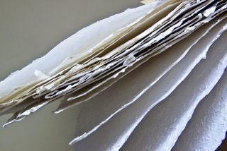
Photo: Trois © Pat Beary
The Soho Photo Members’ second annual Small Works Exhibition, which opened on February 9th at the Soho Photo Gallery in Tribeca, captured the power of “small” as part of a creative competition showcasing photographic images no larger than six by six inches. Baby boomers will remember how Volkswagen capitalized on the concept with their 1959 “Think Small” ad campaign, the highest ranked in the 20th century. Small is as disarming, sexy, and fun in cars as it is in photographs as demonstrated in this beguiling show which provides a fashionable reprieve from the ubiquity of supersized images. Veteran Karen Marks, Exhibitions Director of the Howard Greenberg Gallery in New York, acted as juror.
Papier, the series by first place winner Pat Beary, was prominently featured at the entrance of the non-profit cooperative gallery. Un, Deux, Trois, Quatre, and Cinq form studies of hand-made paper found by the photographer in a Parisian boutique. Exemplified by the topography shown in Trois, Beary captures paper’s organic, birch and coral-like properties, and most important, the imagination of anyone who writes or draws.


 RSS
RSS
