De la Nada Muerte A la Nada Vida, 2010

Lush and tactile, the canvases heavy with paint, José Lerma is known for his texturally seductive, semi-abstract paintings that allude to the idea of a formal portrait. Recognized for his abstract, expressively personal paintings, Lerma ventures off the canvas to a conceptual, almost sculptural practice in his latest show, “I am Sorry I am Perry” at Andrea Rosen Gallery. In three parts, the bankers, the curtain, and the keyboards, Lerma references both personal and historical narratives, yet encourages the viewer to create their own.
José Lerma (b. Spain, raised in Puerto Rico) lives and works in New York and Chicago, where he is on faculty at the School of the Art Institute of Chicago. Currently, he has a solo show at Andrea Rosen Gallery, New York, NY. “I am sorry I am Perry” is on view through January 22, 2011. Additionally, “A Person of Color/A Mostly Orange Exhibition” – a group show curated by Lerma, opens at Green Gallery, Milwaukee, WI, on January 22, 2011.
Amanda Schmitt: Rather than just a showing of new paintings, “I am sorry I am Perry” seems to me to be a very thoughtful exhibition with clear formal and conceptual intentions. Are you both the artist and the curator?
José Lerma: I planned this exhibition around 3 elements that I had worked with in the past. Curating is a good way of putting it. Even before I started making art, I loved Mardsen Hartley’s paintings of Von Freyburg. I like the idea of a collection of objects and stories collapsing on each other and becoming, in effect, a portrait. In that sense, all my shows are a kind of curated self-portrait. However I didn’t want it to feel like discreet parts that were there to be decoded instead I wanted the viewer to arrive at kind of “fourth reading”; I love when clarity devolves into babble and facts become aesthetics. What I mean is that what matters to me is the effect that the parts have on each other and not their individual meanings.

John Law, 2010
AS: Reading the press release for “The Golden Sea” at Andrea Rosen Gallery back in 2006, the focus of your work seems to have shifted: it is no longer as self-referential, and now seems to more so reference other artists and other histories. You also seem to be less focused on your intimate contact with the paint, and more focused on the conceptual-weight of the materials (the 3M curtains, keyboards, etc). How do the works in this show depart from your previous work?
JL: My work has always been either painting, or works about painting. Initially, I was attracted to it because it was a very direct way of exploring personal mythology. I knew early on that I wanted to make autobiographical painterly works but I was also attracted to painting because it was the least popular medium among my friends, particularly in Puerto Rico, most of which were at the time emulating artists like Gabriel Orozco, Francis Alys, or just working on new media.
What I really loved early on about painting was its immediacy, and the fact that it was ideal for dealing with certain events from my youth. I could convey the awkwardness of being thirteen by painting an oversize pink polo shirt and a skinny neck. I didn’t need actors, an audience, or even much space. Plus it enabled me to work very fast. If anything, this feels like a synthesis between my early post-studio work and the paintings of the last 5 years. It feels very natural and complete to have all these bodies of work in a space.

OLL KORRECT, 2010
AS: Although you reference specific historical figures, your portraits are often left without a face. Why this anonymity? Are these people specific to you, or were they meant to be unspecific to everyone?
JL: My previous paintings (paint portraits, 2006-2009) were abstract references to portraiture but without likeness. In this new body of work, I am not interested in psychological portraiture. Instead I am more interested in the trappings of power, the visual cues, the posture, the wigs. I guess there are classic regal and patrician features, certain noses and lips for instance. The figures I choose are not usually well known enough that it would matter if I had included their face. There are other bankers throughout history who are far more recognizable – Salomon Chase, some of the Rothschilds, Medicis, and of course a lot of contemporary money managers – but I wasn’t interested in directly addressing current events.
The only face whose features I have consistently drawn was that of Charles II of Spain. He had the proportions of a caricature due to many generations of inbreeding among his predecessors. He was truly a tragic figure: at once one of the most powerful and one of the weakest men in the world.

Jac Fugger, 2010
AS: Your work is dense with allusion. Did you study a lot of art history? Or history in general?
JL: I mostly read history. I had a good background in social sciences and was also getting my J.D. when I decided to study art. Maybe for that reason I was drawn to a lot social satire from the 18th and 19th century especially James Gillray, Daumier and Hogarth. My earliest series were portraits of historical figures as children. Early on, I spent a very productive summer at the UW-Madison library. That summer I made no art, and spent every day at the library. I built a huge catalogue of contemporary images and strategies, which I proceeded to cannibalize for the next year. Only later did I stop looking over my shoulder and began to steal more from myself, from the things that honestly had interested me in the past.
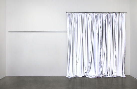
AS: Tell me about the curtains in this exhibition. How long have you been using this material and where did you find it? What sort of formal or conceptual role does it play within the exhibition?
JL: This is the fourth and largest version of a reflective curtain that I have made so far. The fabric is a reflective material made by 3M, mainly used as a safety precaution at night. On one hand, I like that the curtain, when in the gallery, can almost become a light emitting object. However, I am mostly entertained by how the curtain acts in relation to the keyboard pieces. It flattens as you approach one keyboard or it becomes dull as you approach another.
I think all the elements together give a very subtle cinematic illusion. You can arrive at certain effects and somewhat change the read of a painting by a kind of triangulation between the relative positions of light sources and sounds.

The Glib Decade, 2010
AS: To me, your work is very humorous. Between your MFA exhibition at UW-Madison (in which Lerma power-sanded a hole deep into the wall of the MFA gallery, revealing layers upon layers of past installations and wall-painting from decades of students’ past work) and the “Saddest Chord in the World,” (which consisted of a Yamaha DX7 keyboard leaning vertically against a wall, with the D, F and A keys held down by means of masking tape, creating a D minor chord, playing throughout the course of the exhibition) it seems to me like you’re poking fun at everyone else around you: critics, professors, curators, and other artists. Do you find your own work funny?
JL: Most art is never really that funny to me. Some exceptions are Sean Landers, Scott Reeder, Peter Land, Mike Smith and William Wegman. I guess ideally I would love to make works that are heartbreaking. Instead, in reality, most of my works deal with the tension between the heroic and the pathetic.
I am interested in tragic figures. The ascent to power and then an abrupt plummet are a favorite theme of mine. One of my favorite scenes is from the movie Ridicule by Patrice Leconte where the character played by Bernard Giraudeau is defending the existence of god in front of the king with amazing showmanship, and in an act of hubris goes from the most sublime moment of his life to the lowest in a matter of seconds. How we chose to fuck everything up is always fascinating.
 RSS
RSS
