[ Content | Sidebar ]

Uncategorized

Animals Spell Love—for more love in the world add words, pictures and type

by Gabriella Radujko on November 30th, 2016

If Filippo Tommaso Marinetti, the early twentieth century founder of the Futurist movement in Italy were alive today, he would recognize the influence of his radical use of typography as a visual element in author/illustrator/designer David Cundy’s debut word and picture book, Animals Spell Love.

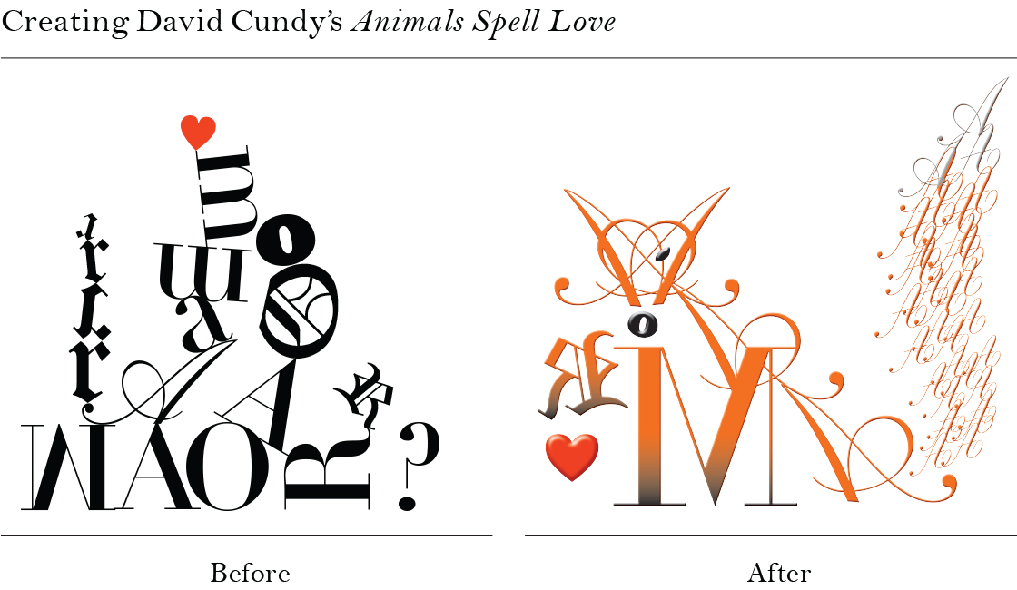
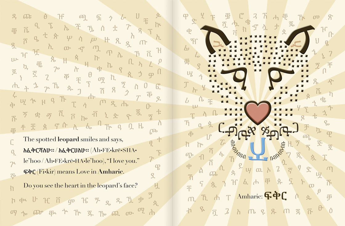
The process of turning a jumble of fonts into an animal (see illustration) was the starting point for the artist’s exploration of typography as a way to “make the world a better place” by writing a book about love.  This before-and-after illustration will give graphic designers as well as laypersons insights into how the author’s interest in language and alphabets became transformed into a book.

In Animals Spell Love, Cundy uses a novel approach to promoting discovery and appreciation of foreign languages by shaping animals out of letterforms which spell the word “love” or the phrase “I love you.”  Cundy features sixteen different languages from Czech to Amharic to Korean.

His exploration of the features of Amharic, for example, which has 231 letterforms (see image) was especially challenging, yet every one of them is shown on the spotted leopard, whose nose is heart-shaped.  Looking for hearts, which can be found in each animal vignette, encourages the reader’s playfulness, adding value to the puzzles and “word pictures” to elevate this picture book’s universal appeal.

Winking foxes, watercolored seahorses, and moonlit owls make allusions to art, poetry and cultures while animating the word love as it appears in multiple languages and alphabets.

Hands “speak” in the last spread, using American Sign Language to say, “I love you” with a diaphanous butterfly as the featured animal.  The book concludes with a world map of the languages included along with representative animals  plus an index of fonts and ornaments.

Cundy’s typographic artwork “augments the expressive force of words,” which refers to Marinetti’s aesthetic agenda a hundred years ago, beyond the “gorgeous” illustrations as described by his publisher, David R. Godine.  His hope that “the book conveys the importance of kindness, the fun of learning, and the wonder of diversity” is a welcome sentiment for the season.

The Original Art 36th Annual Exhibition at the Museum of American Illustration at the Society of Illustrators

by Gabriella Radujko on November 13th, 2016

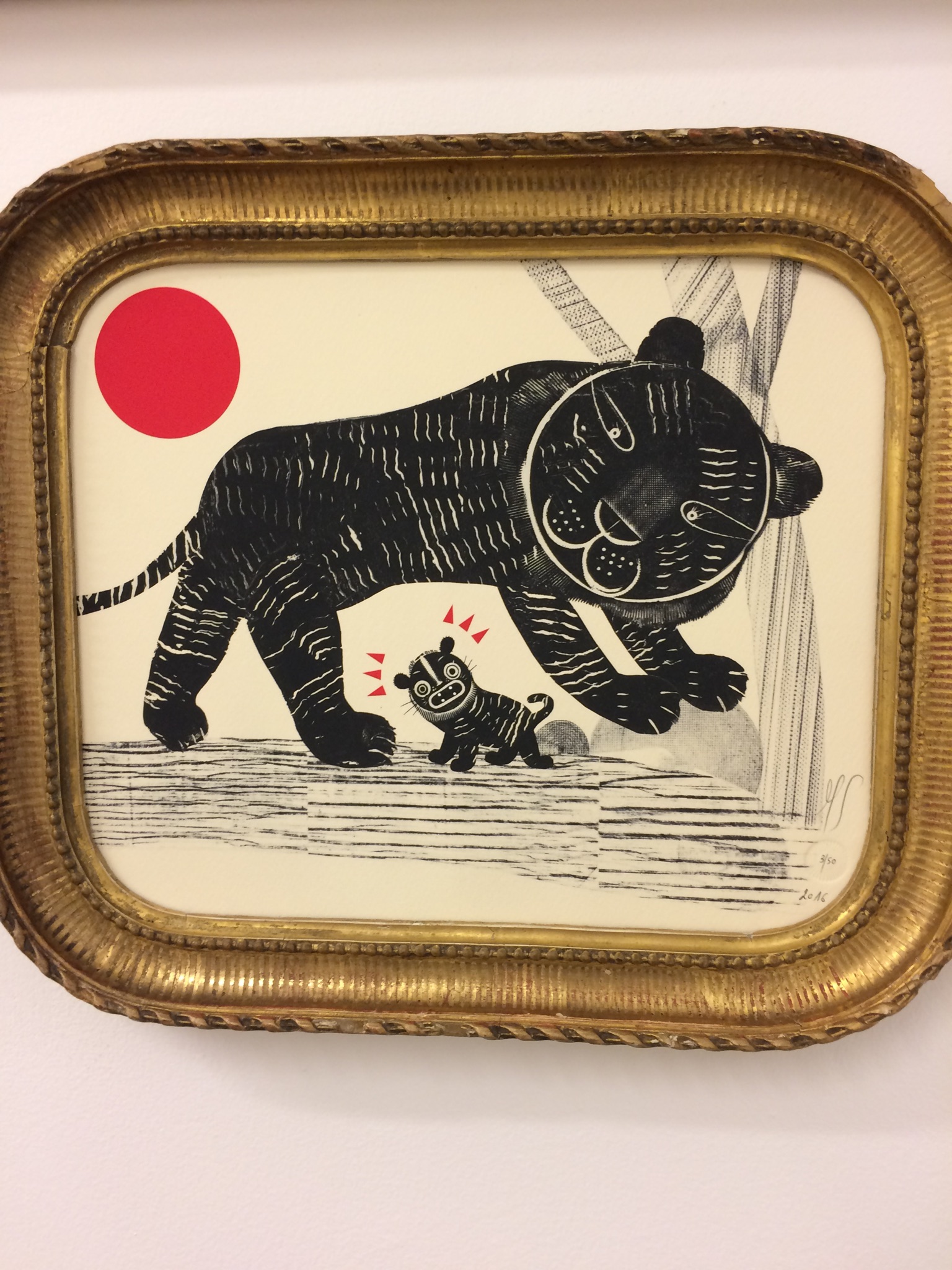
Photo credit: Gabriella Radujko. "Trunk to Trunklet" Illustrator: Mandana Sadat; Author: Jorge Luján; Medium: ink, collage, digital; Publisher: Enchanted Lion Books

The illustrations found in children’s picture books are the subject of the annual exhibition of The Original Art, no doubt so named because it describes not only the exhibition of original artwork but also the first art a child sees. Cross referencing illustrations from 132 picture books with copies of the corresponding books in metal racks in the center of the first floor gallery at the Society of Illustrators, through December 2016, makes for a unique, interactive experience.

The show is a testament to how adults and children long to be in the presence of special things. Visitors will invariably wonder why our regard for this art form, groundbreaking when it first appeared in the early 20th Century, perennially persists beyond childhood, with great affection and sentimentality.

Picture books appear to be quite powerful, physically connecting us to the real world as much as imaginary ones through visual literacy.  They synthesize emotions, organize information and give young and young adult readers the courage they need to handle their ever-changing lives.  At the same time, they remind us of art’s role in our early lives as children.

In The Story of Mankind, artist/illustrator Hendrik Willem van Loon writes that the first five years of a child’s life are mainly devoted to art, with music, in the form of cooing, as his/her first contribution.  Later, mud-pies become sculpture, with painting following with the use of chalk, paint and paper in exploration of the basic elements of shape which include the dot and circle family and the line family.

The role of art and the corresponding behavior of art making in human life, as described by scholar Ellen Dissanayake in Homo Aestheticus: Where Art Comes From and Why reaches even further back in human history when we “began deliberately to set out to make things special or extraordinary.” Dissanayake suggests that “making special” actually contributed to our survival as a species.

She also describes how art and ritual have much in common.  Both, she claims, are compelling, capturing and holding our attention; both affect us emotionally, bringing feelings into awareness.  They are deliberately nonordinary, stylized and “bracketed off” from real life.

Also, the activities of embellishing, patterning, juxtaposing, shaping and transforming while making art, which are described as part of her provocative argument, are very much on display in the stunning range of media and techniques used by the show’s artists.  These include acrylic and oil on paper, scratchboard and watercolor, watercolor and digital, gouache, pen-and-ink, collage, mixed-media, cut paper, etc., in a coherently curated show with a full color catalog.

Suggestions that we begin our lives as artists and grow up to “make special” to enhance our lives may be two important clues as to why a show about children’s book illustration will reward anyone who continues to appreciate the magic of  children’s picture books.

Zachary Mason’s Upon Reflection

by Peter Neofotis on February 14th, 2016

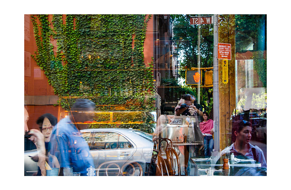
West Village, NYC, courtesy of Zachary Mason, www.ocrazyshaman.com.

Upon Reflection, Zachary Mason’s first New York City solo show, is the aptly named
photographic travelogue currently showing at the Decoy Workspace through January
20, 2016. Most striking is a nude self-portrait set in Central Park at night, framed by a
jogging path beside the Onassis Reservoir, an arching tree in the foreground creating its
sense of depth. An incandescent city looms in the background, reflected in the lake.
Mason redirects the viewer’s attention from cityscape to his eerie physical beauty,
capturing the wildness in him. Tall, trim, but muscled, the 26-year old artist has the
carriage of satyr.

As we see him leaning on the fence surrounding the water reflecting the city, he is a
young man at odds with the city. He is embracing it, yet is simultaneously totally out of
place. The victory over the commercialized metropolis, nonetheless, is his.
Enormously triumphant, the image if of a young man embracing Central Park while
completely ignoring decorum in a city populated by millions. His distinctive youthful
hopefulness, born of another, less tame locale, is unabashed.

Mason pays tribute to 1950’s photographer Vivian Maier throughout the show. Maier
created a series of self- portraits in black and white, most of which incorporated her
reflection, be it in a mirror at a yard sale or the glass window of a train car, to great critic
acclaim. Borrowing many of the same techniques, Mason brings them into a modern
world, in color.

There is a sense that we are witnessing a young artist whose gifted eye is becoming
aligned with an enlighted mind. All of the images in this show use reflection, some of
which, like those of Lincoln Center, a building in Soho, and one of the Mumbai Airport
demonstrate great appreciation for the line and architectural design. There are
numerous stunning landscapes including a star-filled night sky behind mountains
reflected in a lake in Moab, Utah and a skyline of Manhattan at dusk reflected in the
Onassis Reservoir. Viewers not be personally connected to these landscapes might
experience little emotional connection to them.

Mr. Mason’s work engages viewers most is when he takes his lead from Maier,
capturing the world with his reflection in it. There we see a young photographer at a
point of change, in an ever-changing world, striving to find a place for his being. We see
this in the wonderful image taken from behind a bus driver in Sir Lanka, the viewer
sharing his view point as he looks at himself in a rear view mirror and through the
dashboard window to a world that seems so far away but promises adventure to; a very
sophisticated image of a man sitting by himself in a coffee shop in midtown Manhattan,
taken through the store’s glass reflecting women strolling down the street; and paying
homage to Maier again, where the artist holds a camera as he takes a shot through
glass in the West Village. We see the colorful city reflected there, women and men
going about their busy lives, ivy growing up a red brick wall, and the photographer
finding his focus as he begins to see how he connects with others in the world.

Zachary Mason’s Upon Reflection opened at Decoy Workspace, a part-gallery, part-workshop hosting weekly events for the border-community intersection of the Upper East Side and East Harlem. It’s located on 1261 Park Ave; New York, NY 10029. The show run January 7, 2016-January 20, 2016.

Edited by Gabriella Radujko

Inside The Red Studio: Joan Snitzer at A.I.R. Gallery

by Lara Saget on December 1st, 2013

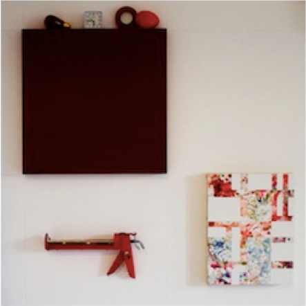
“The Red Studio,” Joan Snitzer’s wall installation at A.I.R. Gallery inserts the artist’s studio into the gallery space, calling for an investigation of the nature of both private space and exhibition space. The title “The Red Studio” comes from Henri Matisse’s influential painting created over a century ago. Snitzer’s installation moves Matisse’s concept into another dimension, transforming flattened space into a dynamic gridded room. The installation itself is made up of painted canvases and familiar, quotidian objects found in an artist’s studio. The viewer becomes a subject within an artist’s studio, immersed in a recognizable yet novel world.

There is no single viewing point. The relationship between the objects and the canvases creates the dialogue. Each object is meticulously placed, building a rhythmic optical experience, which is specific to the gallery setting. Even though the objects are commonplace, the effect is that the viewer becomes a witness to the very act of seeing. Snitzer successfully references Matisse’s painting while bringing it to life in a contemporary way. Snitzer’s self-reflexive clarity coupled with her whimsical aesthetic eye make for a profoundly unique and well-curated installation.

Kira Nam Greene at Accola Griefen Gallery

by Simone Meltesen on May 6th, 2013

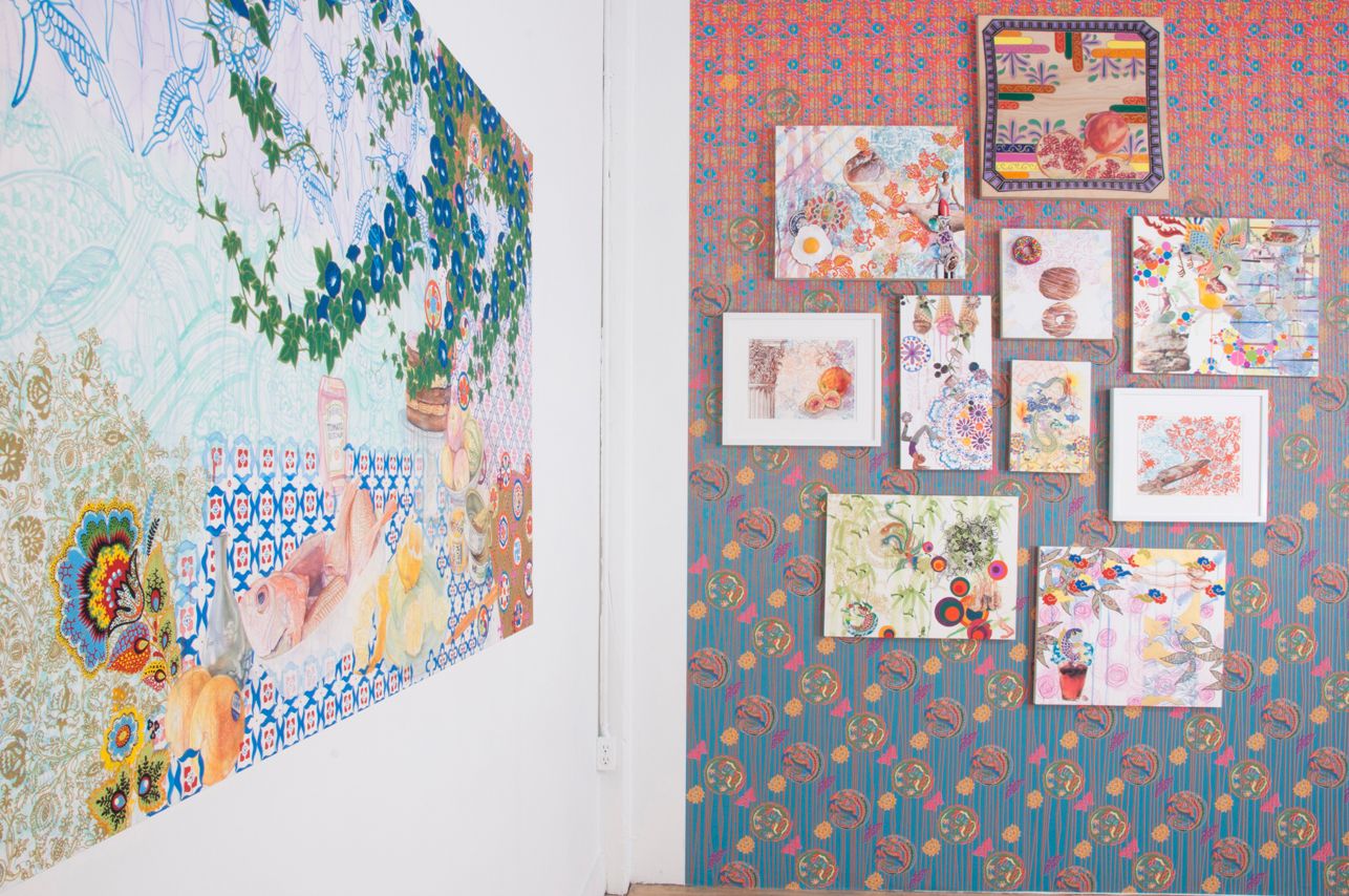
Kira Nam Greene’s first solo exhibition at Accola Griefen gallery consists of mixed media paintings, drawings, and collages that combine the seemingly disparate elements of food and patterning to create hyper-real domestic spaces. Working with a wide range of materials, including watercolor, gouache, colored pencil, linocut, modeling clay, stencil, rhinestones, and ink, Greene’s artworks are as much influenced by 17th century Dutch Vanitas painting as by the Pattern and Decoration movement of the 1970s. Greene’s mastery of rendering techniques and utilization of slippery shifts in perspective come together to create scenes that are at once familiar and unsettling, beautiful and grotesque. Continue Reading More »

Powerless in Search of Sound @ MOMA’s NYC Street Scenes and Noises

by Gabriella Radujko on November 3rd, 2012

In a city made quiet due to power outages south of the thirties, it was an interesting choice to have sought out films exploring noise.  “A Cinema of Industrial Noise”, a series of four films shown at MOMA on Halloween included the twelve minute, 1929 film, NYC Street Scenes and Noises, which slowed time down so appreciably, it seemed twice as long. Continue Reading More »

The Autumnal Equinox and the Uni Project

by Gabriella Radujko on September 29th, 2012

photography © courtesy Sam Davol

Pop-ups–boutique, market or museum have entered the psyche of hip New Yorkers, but if you are really lucky, you will have experienced the pop-up library known as the Uni Project.

Part-library, part-performance space, the Uni Project, a portable library kiosk with curated cubes, popped up on a stretch of waterfront at the Gantry State Park in Long Island City, Queens on the first day of fall. The blustery weather wrestled with the portable bookshelves and seats, but passersby, especially the short, cute variety with parents hovering close by, intuitively browsed, read and celebrated books, played games and explored portable worm bins for indoor composting. Continue Reading More »